The challenge
Beldona is a well-established Swiss lingerie brand that has been competing within a global context over recent years. While fast-fashion brands such as H&M and Zara appeal to their younger customers with a growing and established lingerie offering, international direct-to-consumer brands win over women with refined tastes and a higher disposable income.
The solution
While continuing to focus on the core characteristics of the Beldona brand, such as personal service and long-lasting premium quality, the brand’s voice and appearance have been refreshed to breathe new life into the traditional brand, in order to better convey its positioning, its focus on women for women, and the appeal of its contemporary offering.

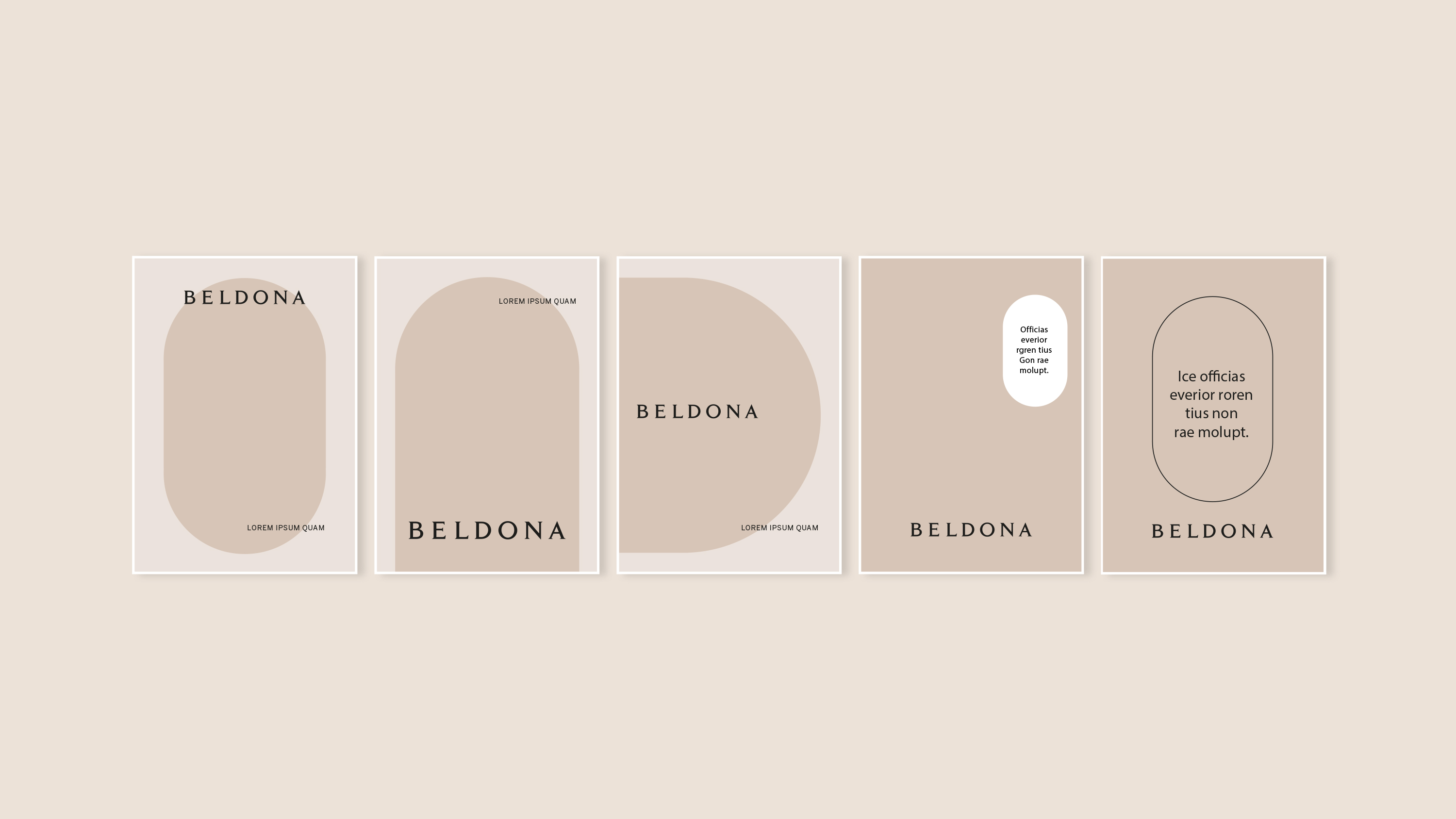
The brand’s evolution embraces the elegance and sensuality unique to the feminine spirit. We’ve transformed the classic “B” shape into a series of graceful, rounded forms that elegantly dictate the flow of our layout. The logo remains a nod to our heritage, ensuring continuity, yet the new letter spacing breathes new, contemporary life into the design, striking a balance between tradition and modernity. The colour palette now thoughtfully reflects a spectrum of skin tones, harmonised with shades that resonate together in a sophisticated, nuanced ensemble. This refined approach is a tribute to the diverse beauty of women, capturing the essence of modern femininity.
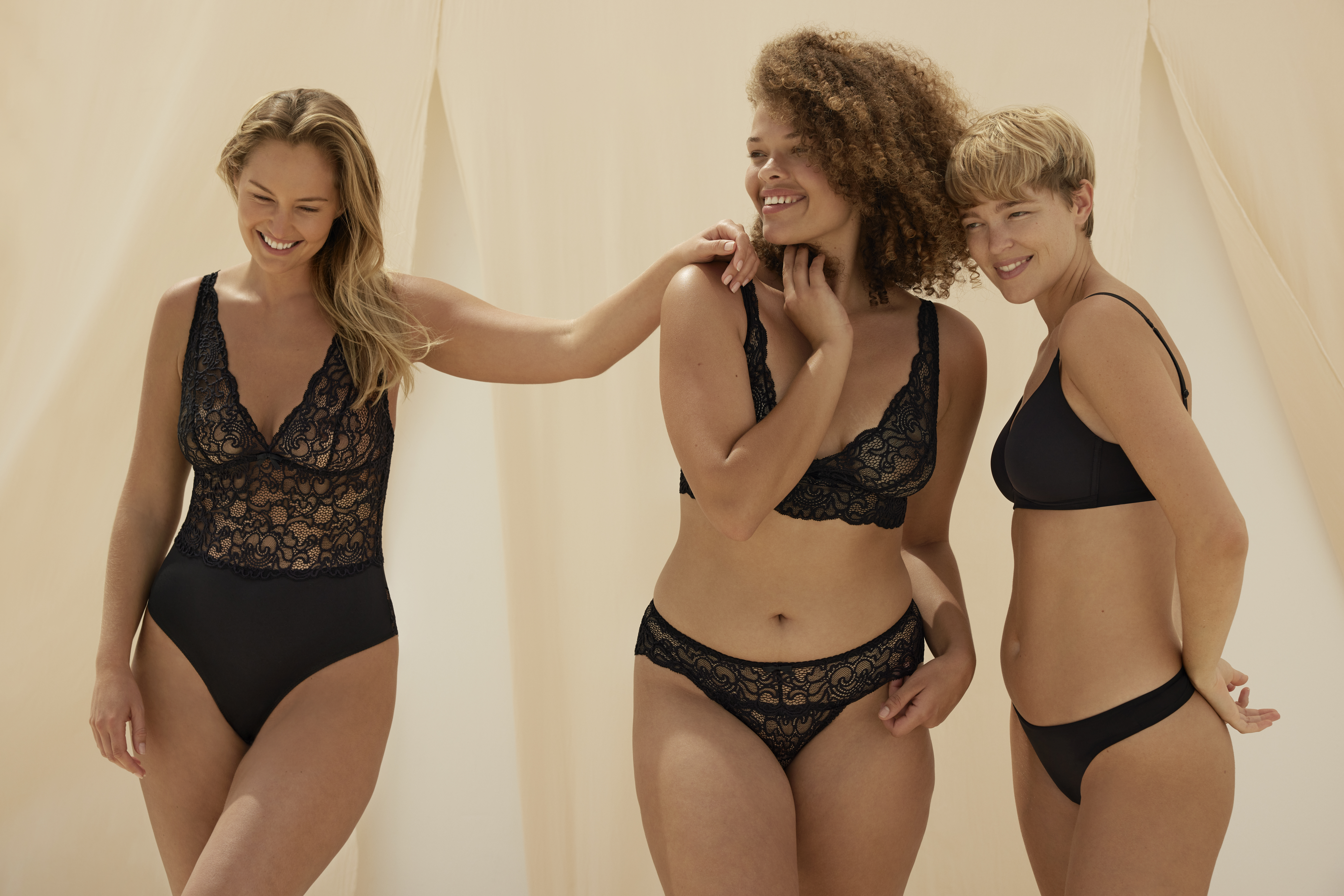
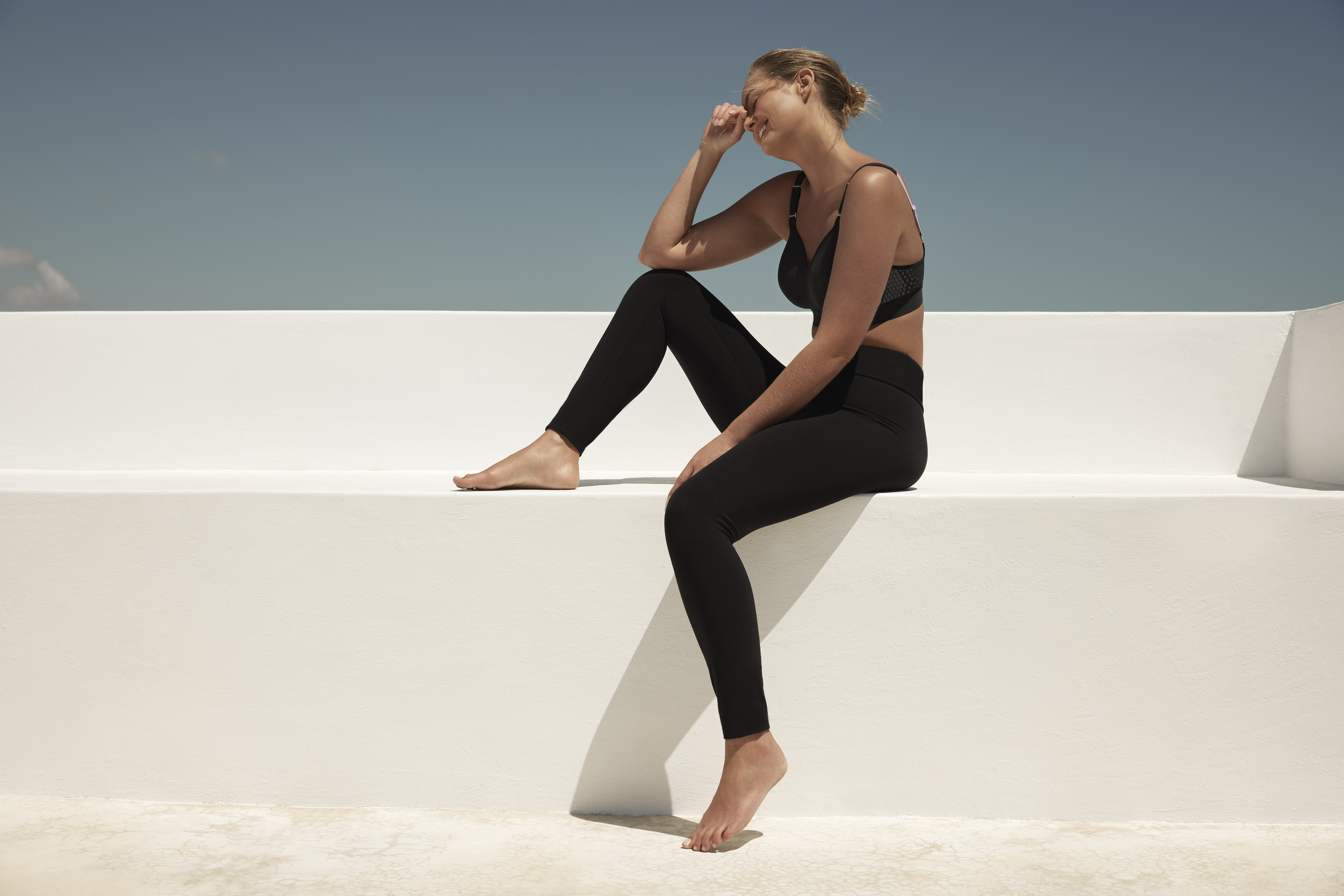


The brand’s imagery is a collection of authentic moments, a canvas where every woman is portrayed as effortlessly herself, exuding natural confidence and ease. This visual narrative celebrates the authentic essence of being. To seamlessly align with various needs across channels, we’ve defined three layers: key visuals are imbued with evocative storytelling, campaign images capture the vibrancy of the seasonal setting that is portrayed, and e-commerce photos are tailored for clarity and connection – each style cohesively reflecting a commitment to genuine, elegant representation and implemented masterfully by different photographers.
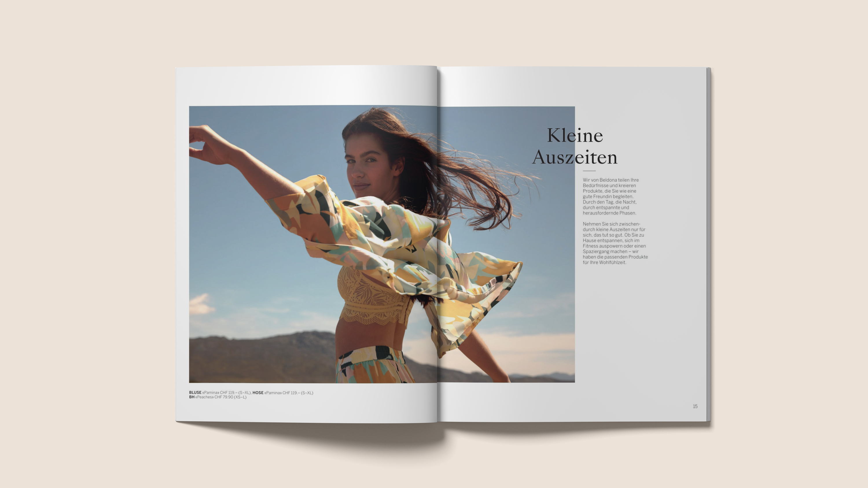
In print, the interplay of rounded and square shapes creates a visually appealing focus on the products, with a spaced-out layout that showcases each lingerie piece to its best advantage. Images are interspersed with editorialelements and succinct statements, adding depth and a playful charm to the overall impression.
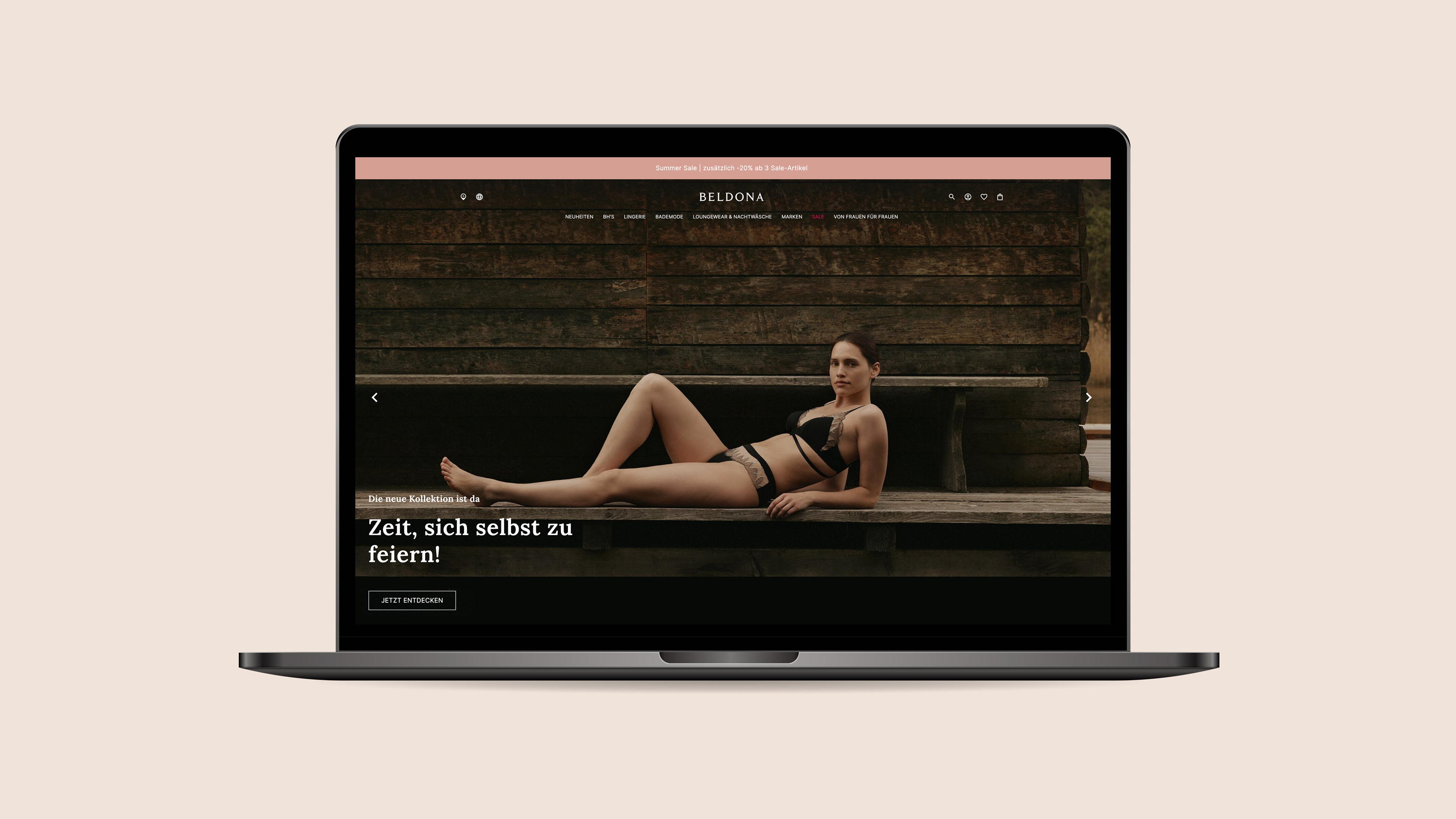
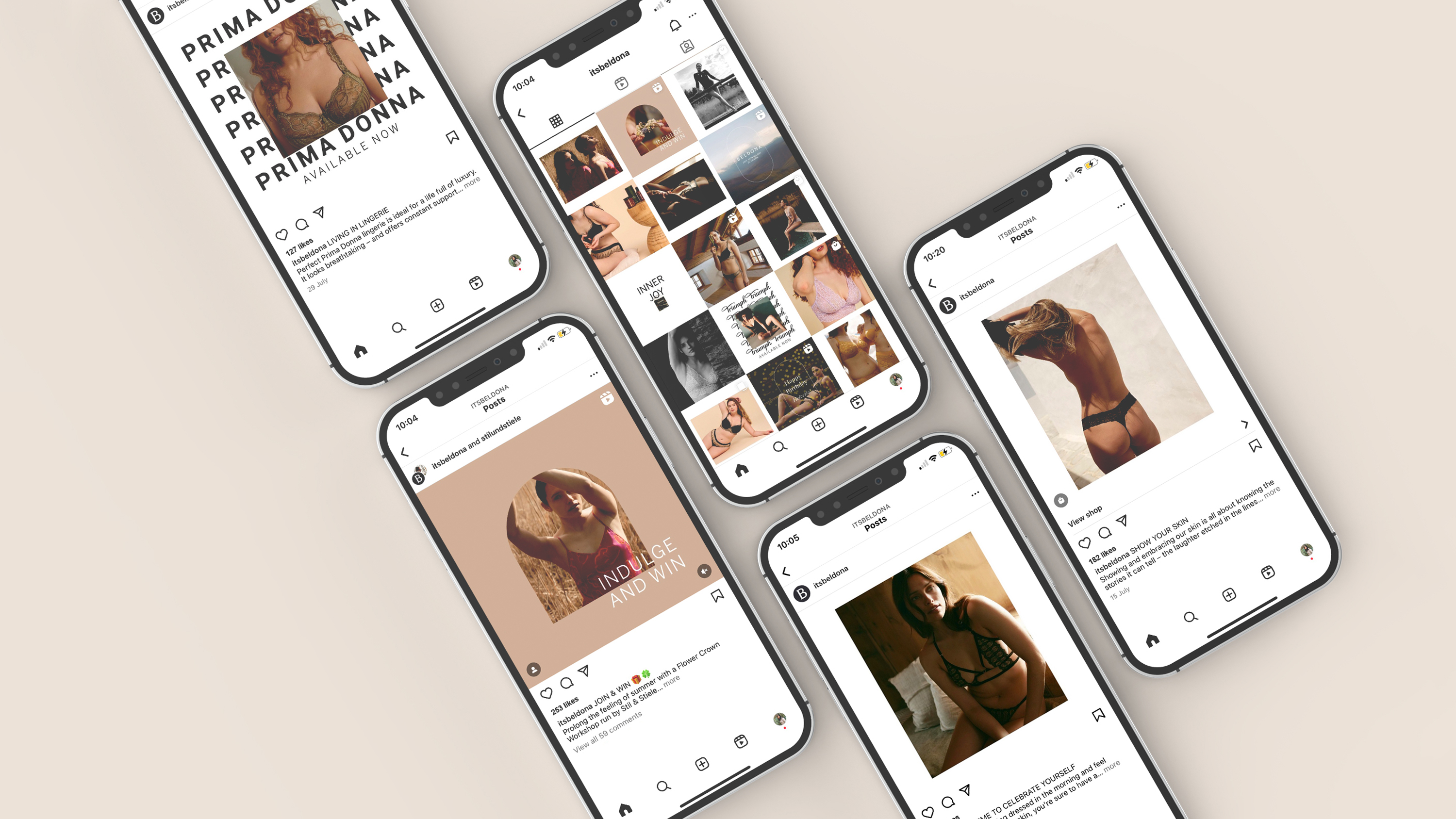

In defining the look of our digital applications, we have embraced an approach that combines strong key visuals with playful, engaging language, a testament to Beldona’s dedication to elegance and simplicity. This style, consistent across all digital applications, reflects a refined and unified digital presence, seamlessly implemented by the Beldona team with their existing partners.
Website: beldona.ch