The challenge
Following rising trends towards preventive healthcare, over the years the RehaClinic Group has expanded its core offering in inpatient and outpatient rehabilitation with a best-in-class preventive health offering. Both, existing naming and brand, did not convey this new strategic approach to health.
The solution
A new name, ZURZACH Care, and a comprehensive rebranding bring to life the new strategic approach to health. They are better suited to convey the expanded offering of the Swiss market leader for care management across all touch points.
Founded in the 1950ies as RehaClinic in connection with the healing thermal springs of
Bad Zurzach, the group has grown to be the market leader for care management. Its rehabilitation core offering has been continuously expanded and complemented with a just as relevant best-in-class preventive care offering.
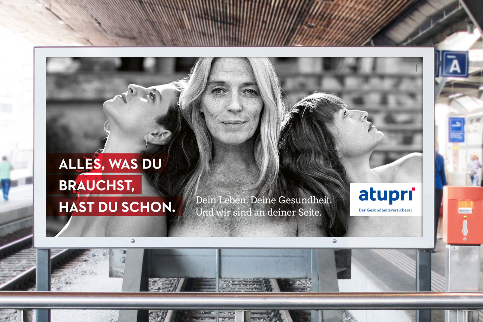
The new name, ZURZACH Care is a celebration of past and future: it stands for the company’s heritage but also for its aspiration to continue to care for and serve evolving personal health needs. A spirit that is conveyed by the brand appearance at all touch points.


At the core of the design system lies the idea that by combining two elements more added value can be generated. In fact, the logo is formed by two contrasting typographies representing past and future as an enriched way forward. Besides the overarching warm brown tone that conveys a sense of closeness, colder color tones that often represent a clinic-like environment are combined with a touch of warmth to express the group’s caring mind-set. The image world reflects the same color palette and brings together light and shadows as both are part of our days. Just as prevention and rehabilitation can be both part of a lifetime of health.


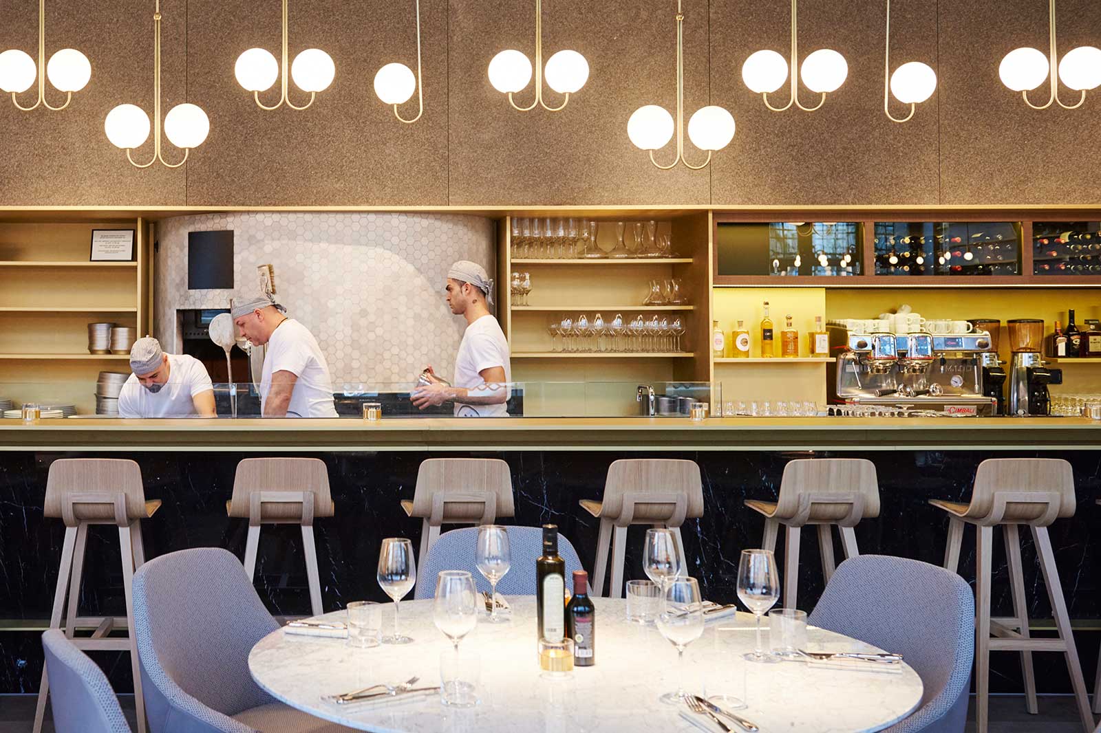
Developed for a flexible yet consistent 360-experience, the brand elements create a characteristic and recognizable look for ZURZACH Care across all touch points: from digital to print, from editorial to advertising, from apparel to directional signage.


Spacious, structured, and human-centric at once. Applied to a brochure or other print materials, the brand appearance accommodates all requirements. It optimally combines the professional healthcare side with the human caring side of the leading group of clinics.
Website: zurzachcare.ch