In conjunction with the CEO and the management, the fundamental elements of the brand structure, brand positioning and brand personality Branders established in accordance with the redefined business strategy.
Operating as a universal bank the Thurgauer Kantonalbank has a strong coprate brand image. With a strong presence at a cantonal level, the bank’s sustainable business model meets its client’s demands with comprehensive expertise. The bank offers solutions for all client needs at every stage of life. In short, all those essential services that allow clients to experience the satisfying feeling of getting «Mehr vom Leben» (more from life). This is voiced in the bank's new claim that also conveys the high level of quality of life in the region.
Thurgauer Kantonalbank
More from life.

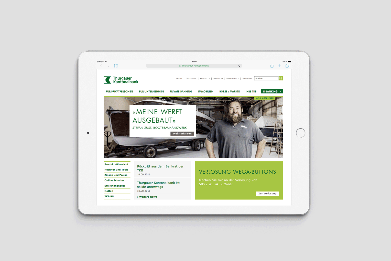
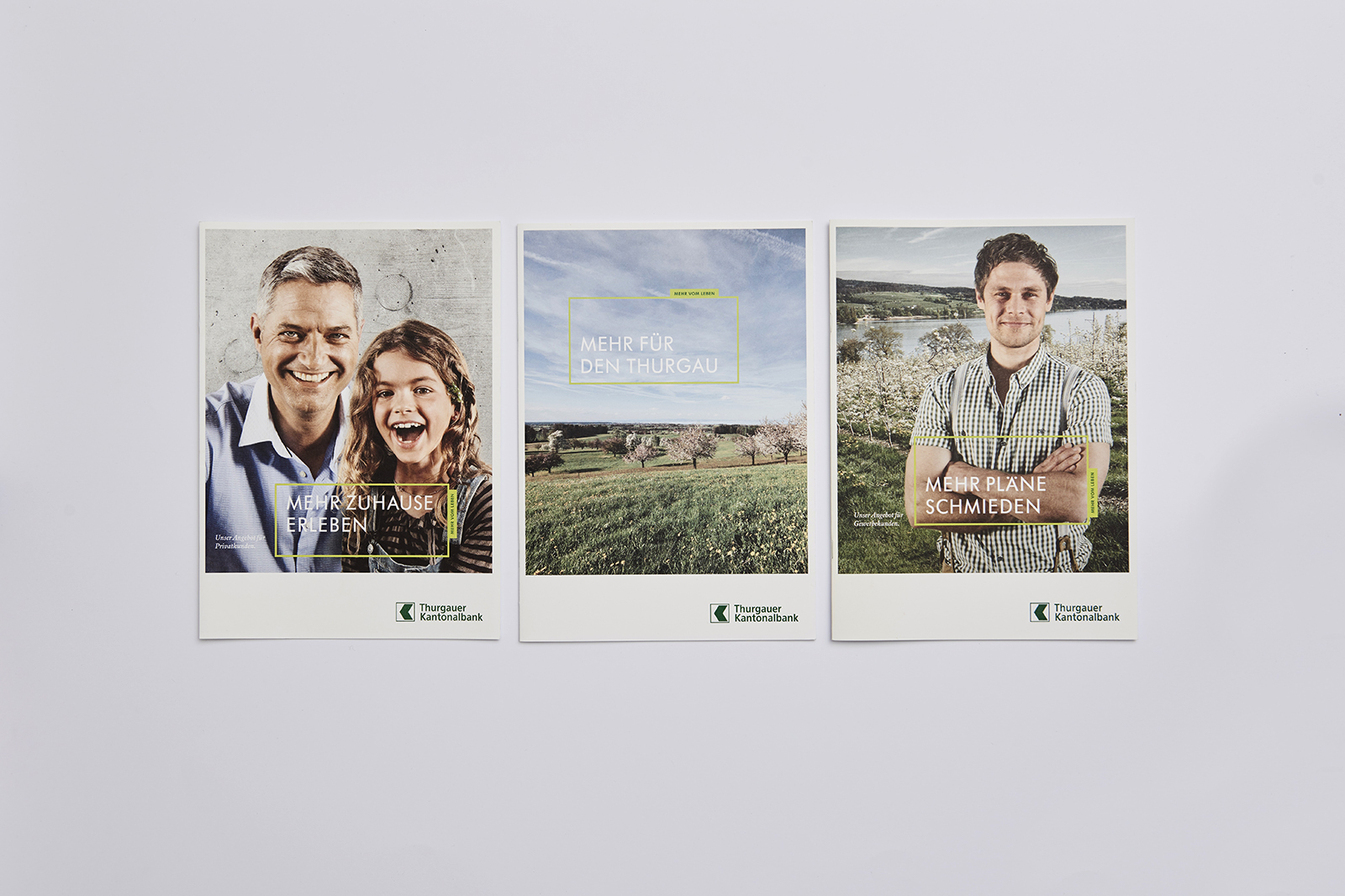
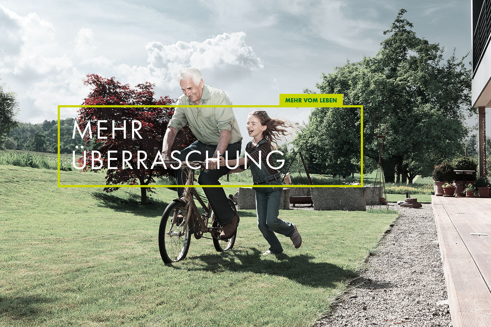
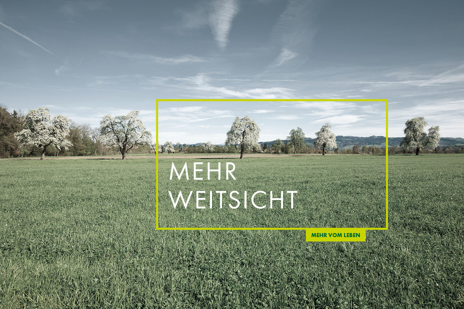
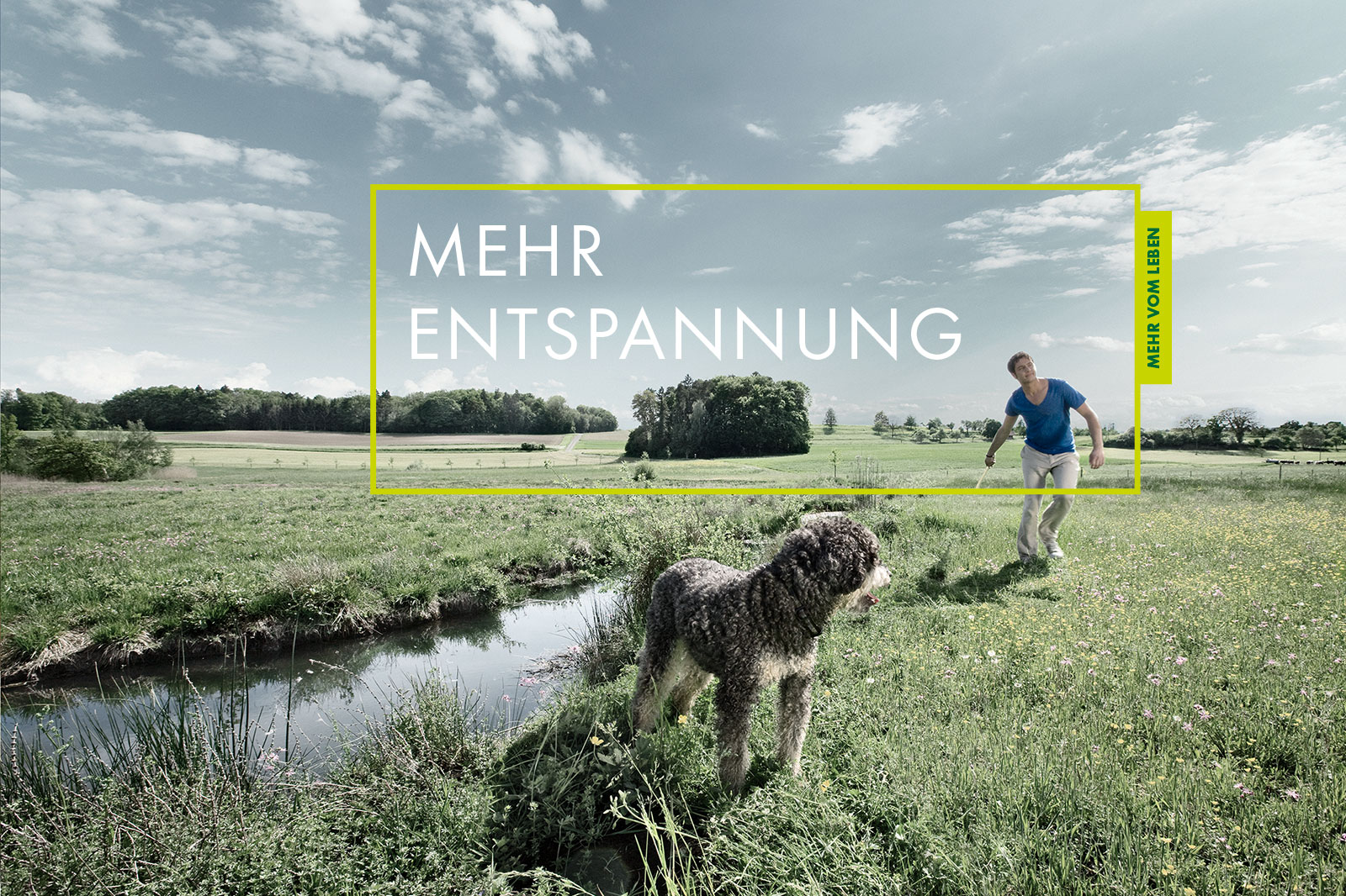
The bank’s new brand identity communicates the «Mehr vom Leben» (more from life) experience. The brand images are aimed at demonstrating the bank's confidence and transmitting to their clients a fresh and personal impression of the bank across the entire brand experience – from the logo via the brand colors through to the imagery.
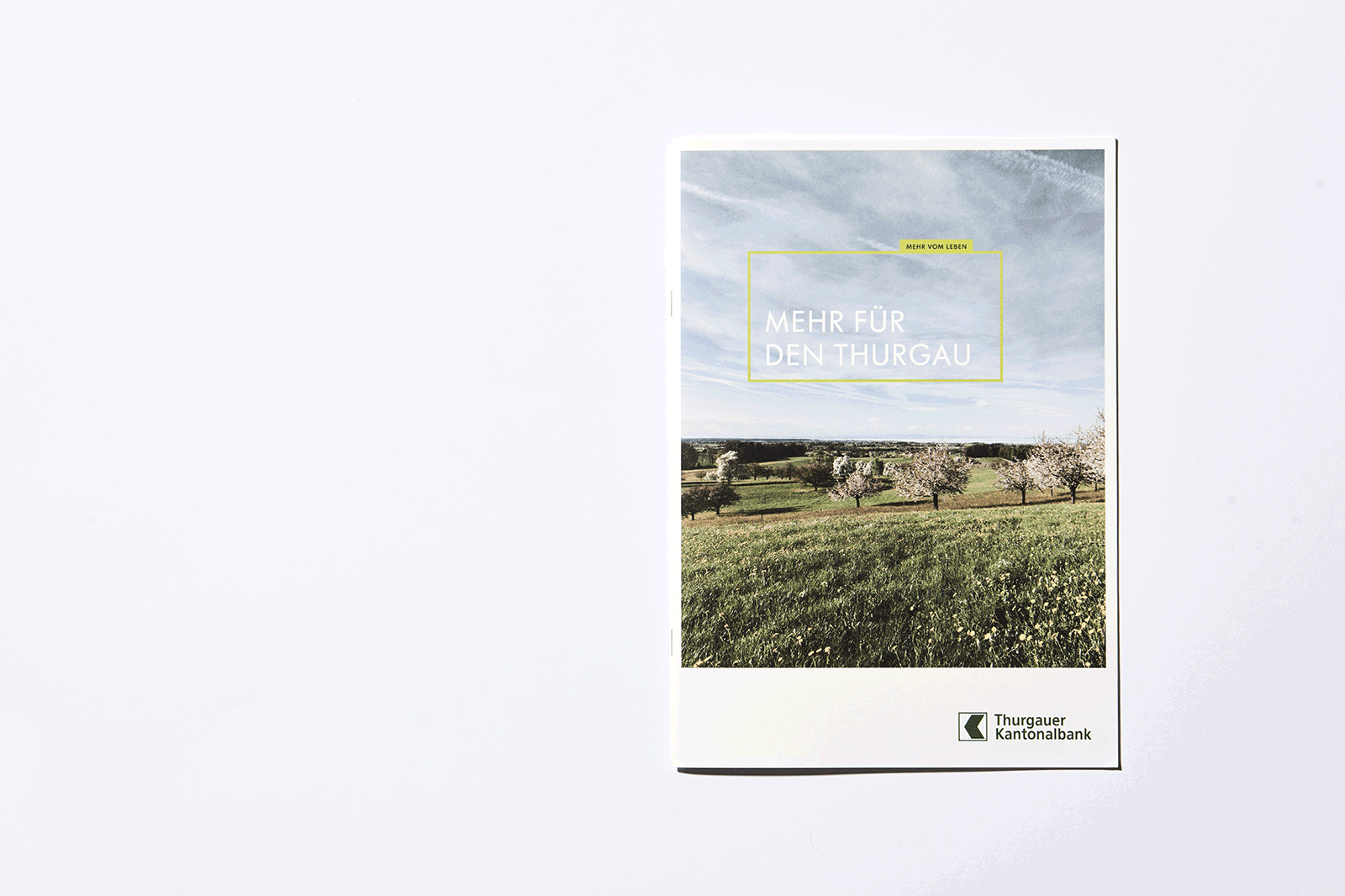
The logo typography and design have been subtly refined and enhanced. Now appearing in the Thurgauer Kantonalbank's characteristic shade of green the logo reflects a contemporary and fresher image.
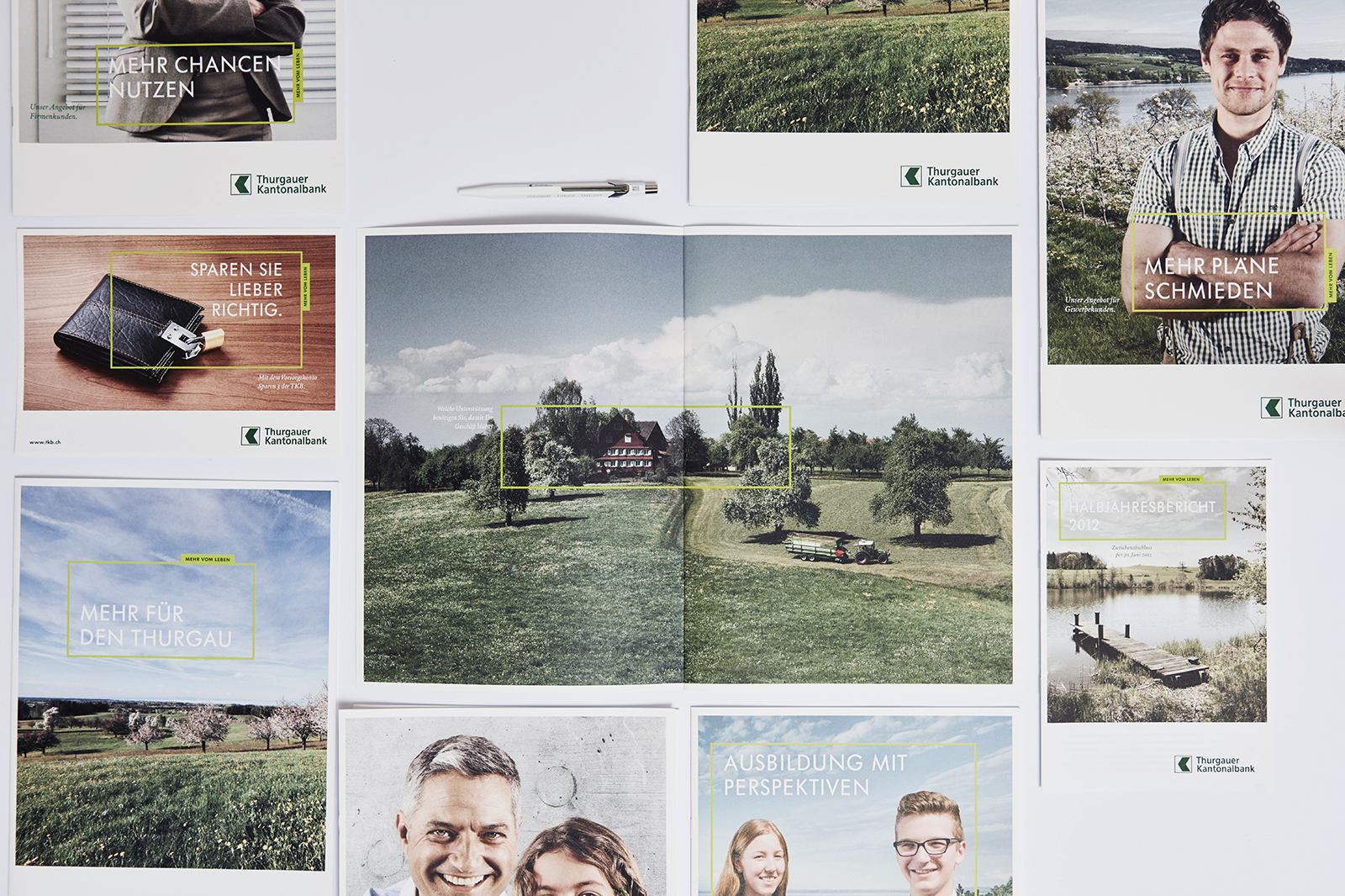
These newly determined color combinations are derived from the diversity of greens and the overall coloration of the rolling hills and meadows which are found throughout the canton. The verdant hues serve to highlight the bank's innovative drive by creating a compelling visual differentiation.
The imagery depicts people of various age groups with a focus on situations and moments in life that express the philosophy «Mehr vom Leben» (more from life). This is achieved by employing sharp contrasts, substantial depth of field and sophisticated use of natural light.
Central to the new brand appearance is the introduction of a focus frame which serves to showcase the core messages.
With its reworked brand appearance, the Thurgauer Kantonalbank is underpinning its claim of being the most client-oriented bank in the canton.
To ensure sustainability, the brand is also positioned in the job market for job candidates and future employees. «Miteinander mehr bewirken» (achieve more together) is the promise the Thurgauer Kantonalbank makes toward its employees. In a long-term change process the brand is also introduced into office routines and employee training in order to, ultimately, be reflected in employee behavior.
The brand is consistently introduced at all points of contact. It is comprehensively and uniformly implemented in print media and brochures, labeling, online applications and correspondence.
The children's program «Carlo» has also been revised and modernized. The fundamentals for the polar bear's character as well as his world of experience were developed by Branders. «Carlo» is visually clearly independent, yet the sender remains readily identifiable thanks to an adaptation of the original brand values and style elements suitable for children. The program brings entertainment to the little ones - on the tablet, the internet or on-site.
Together, the long-term intention of the Thurgauer Kantonalbank and Branders is to strengthen the brand and to position it sustainably. The TKB rebranding was honored with the ReBrandTM Global Award 2013. The ReBrandTM Global Award is one of the most renowned branding awards and is presented annually in New York. Prizes are awarded to the most successfully rebranded 100 brands worldwide.
Website: tkb.ch
Our work for Thurgauer Kantonalbank was awarded with