The challenge
In order for RAUSCH's enhanced brand positioning to have the right effect at the point of conversion – i.e., at the point of sale, when the purchase decision is made – RAUSCH's brand presence on the products and their effect on the shelf had to be closely examined and optimised.
The solution
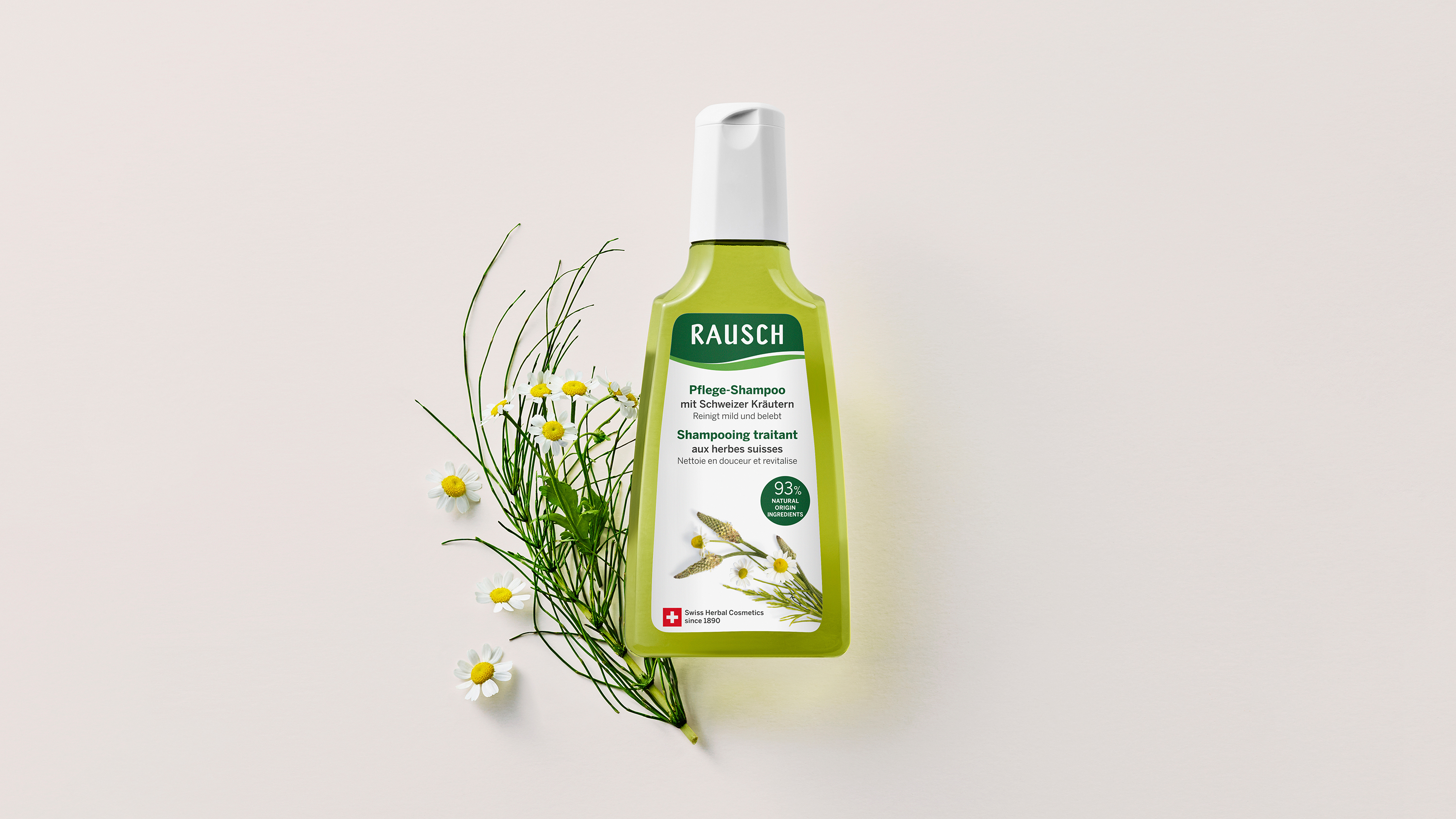
In the initial step, the effect of different design elements and messages on the product labels was analysed on the basis of market research results. Based on these findings, the logo was optimised down to the last detail in an evolutionary process aimed at wielding the optimum effect on the products.
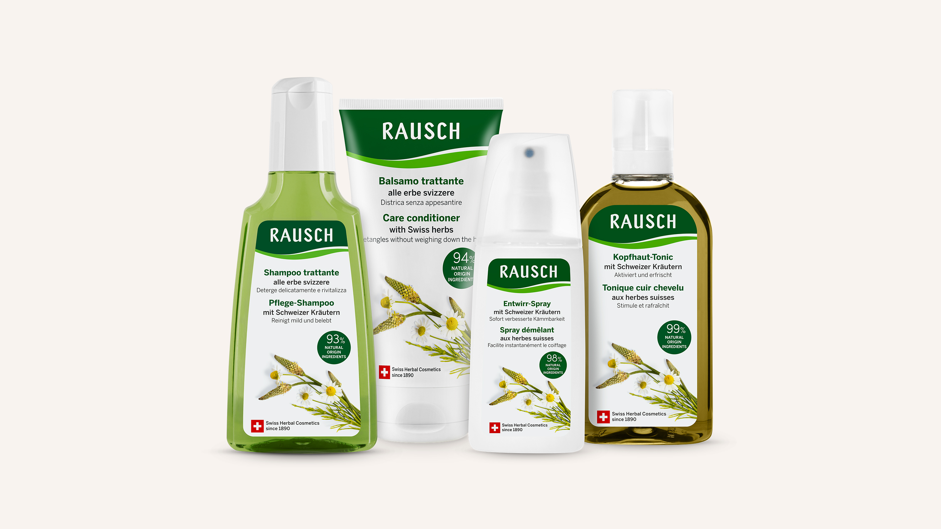
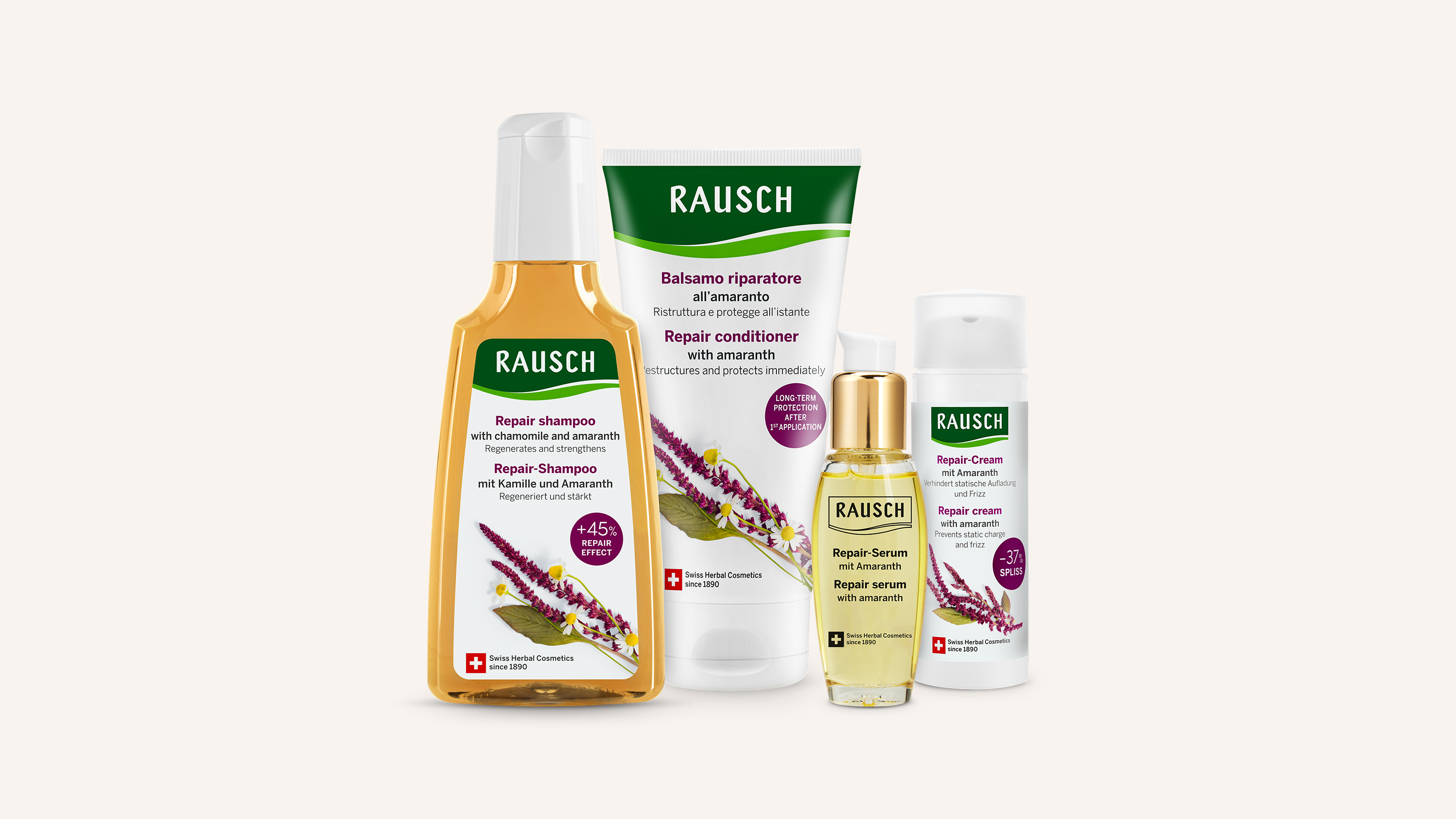
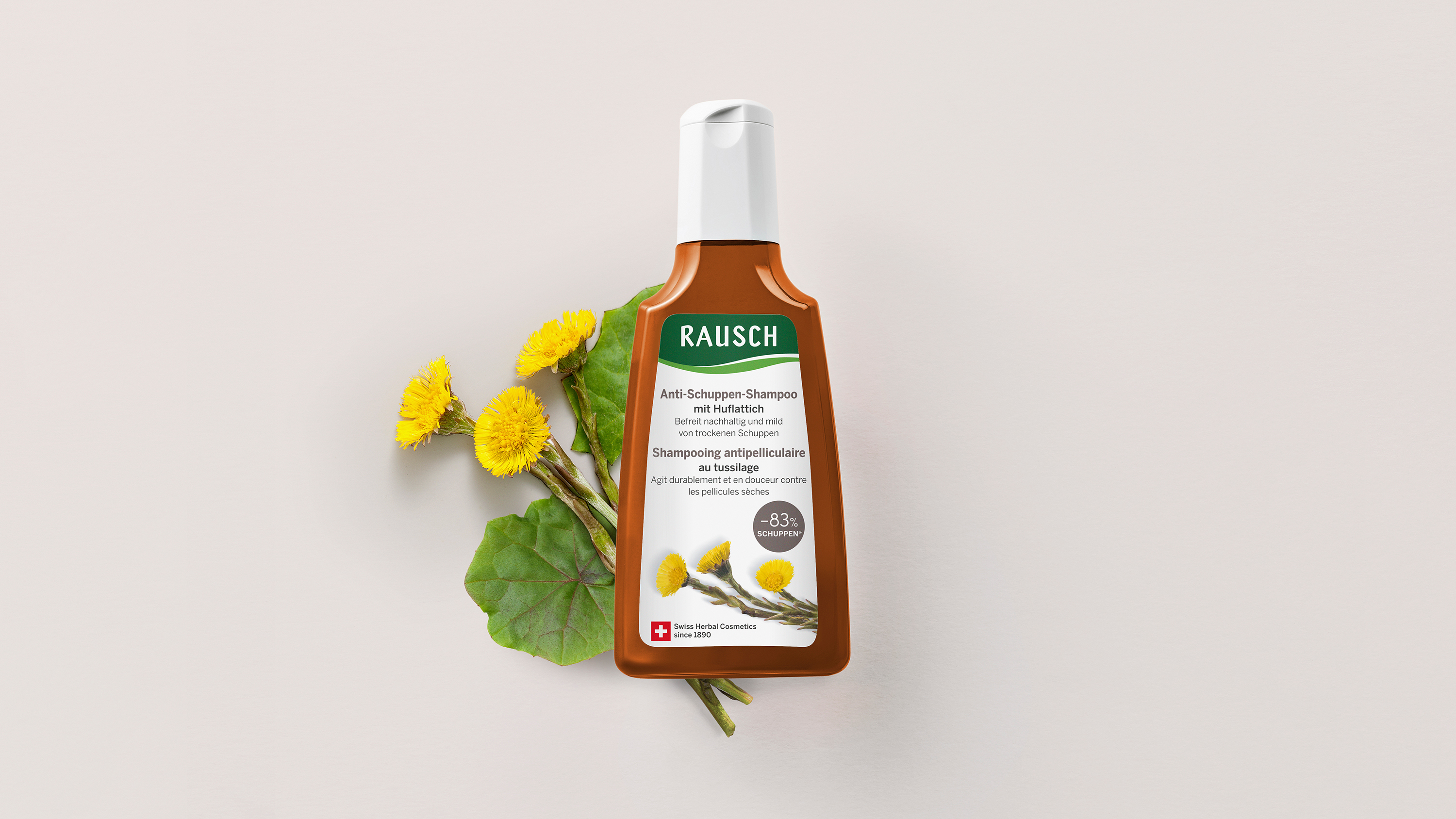
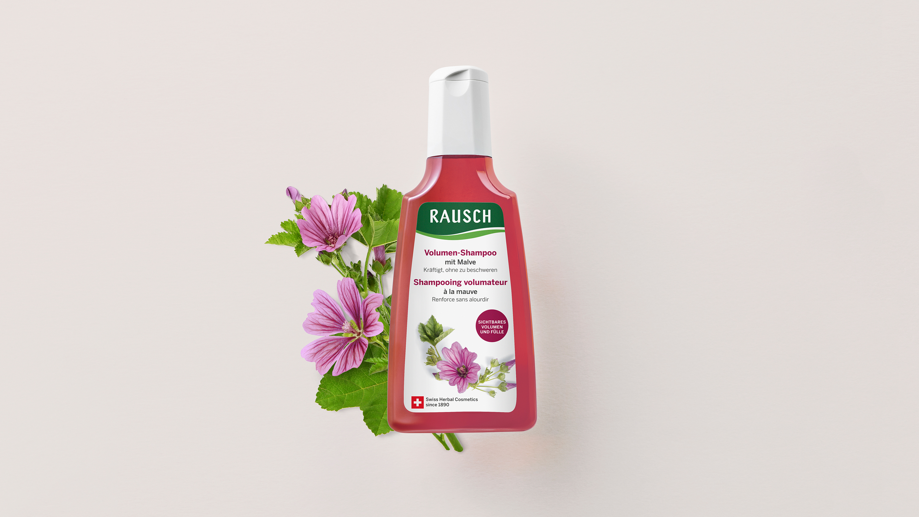
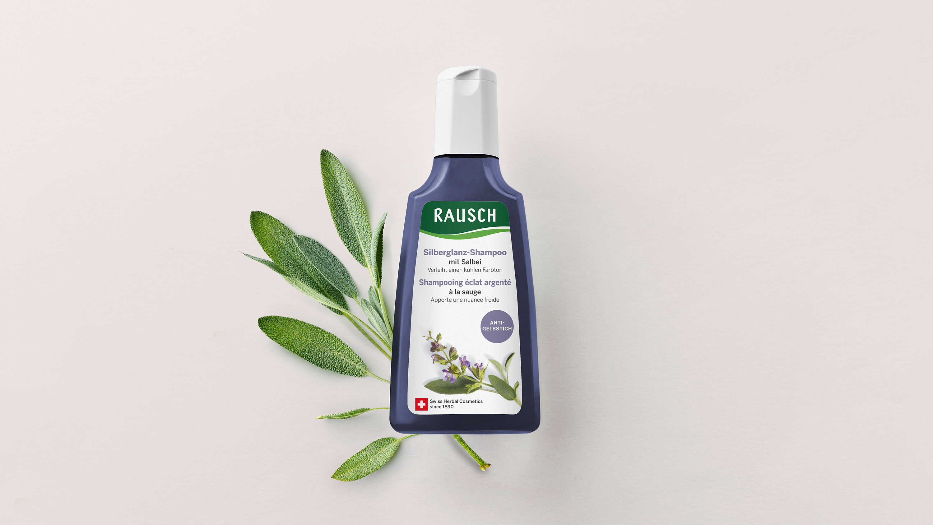
In parallel with the redesign of the logo, all content elements on the hair care product labels were analysed and optimised, from the product features and their hierarchy on the front to disruptors with specific unique selling points and the arrangement of proof points relevant to the target group on the back. In addition to modernising the label design, the feel of the paper used was also reviewed and adapted with a view to conveying a more natural feel. The attributes of authenticity and naturalness, which are anchored in the brand promise, are also accentuated by the use of images on the product labels; for this reason, all images were replaced by images newly shot by photographer Nora Dal Cero as part of the redesign.
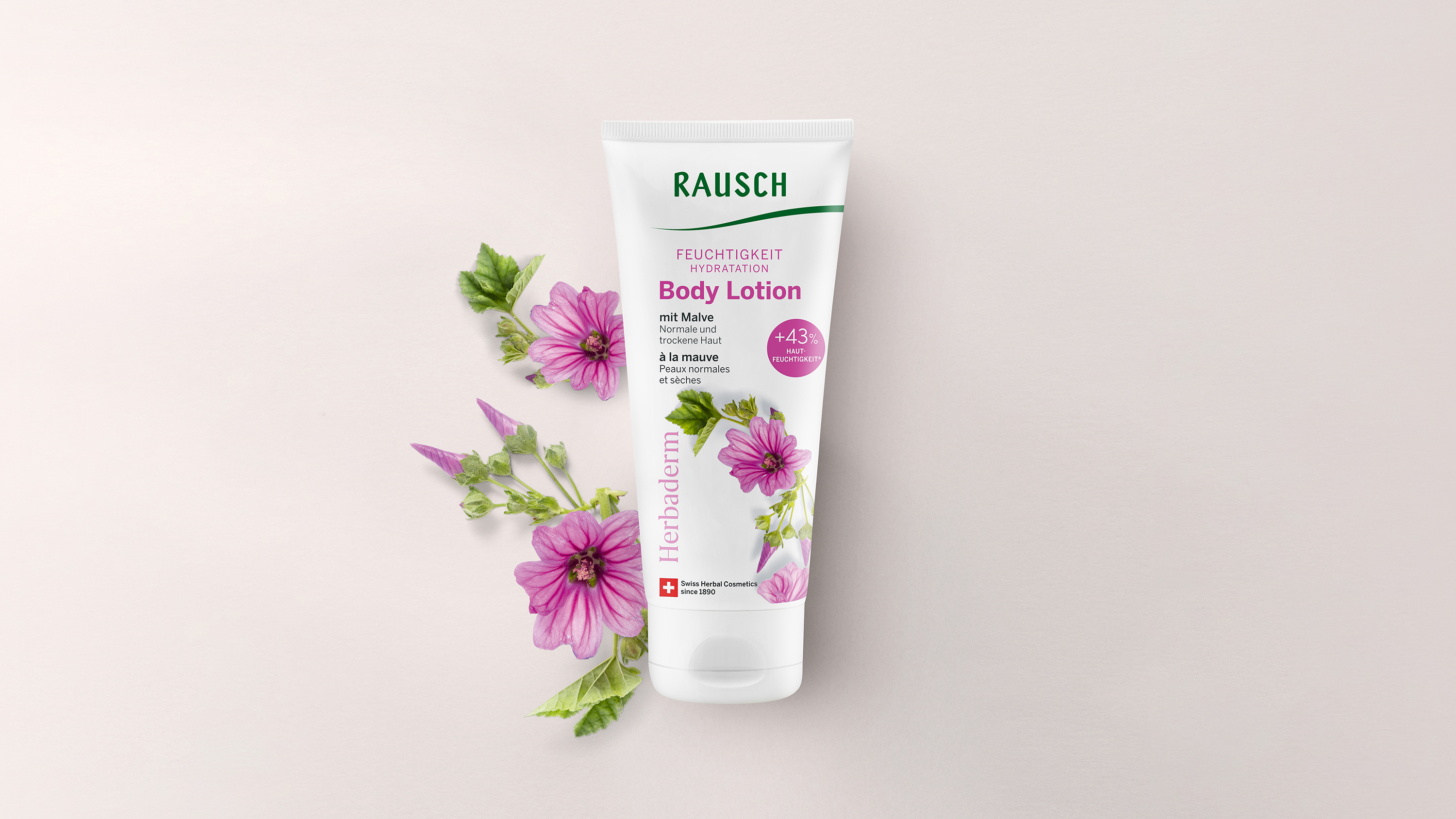
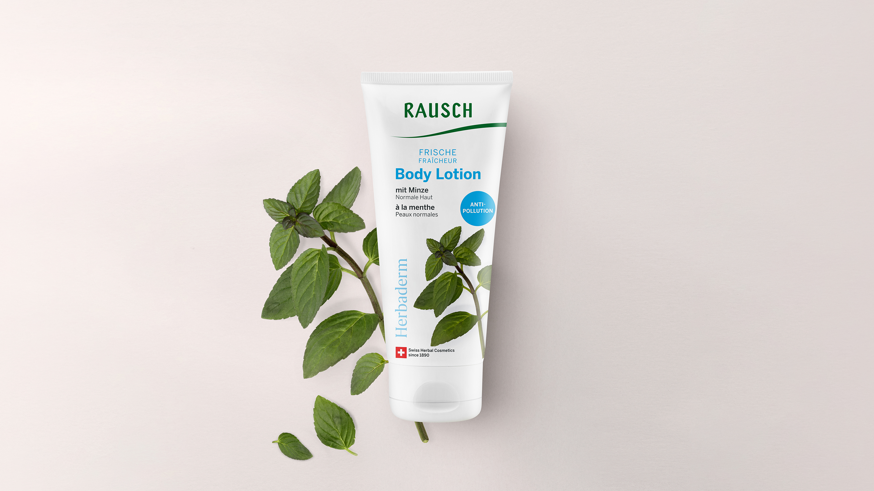
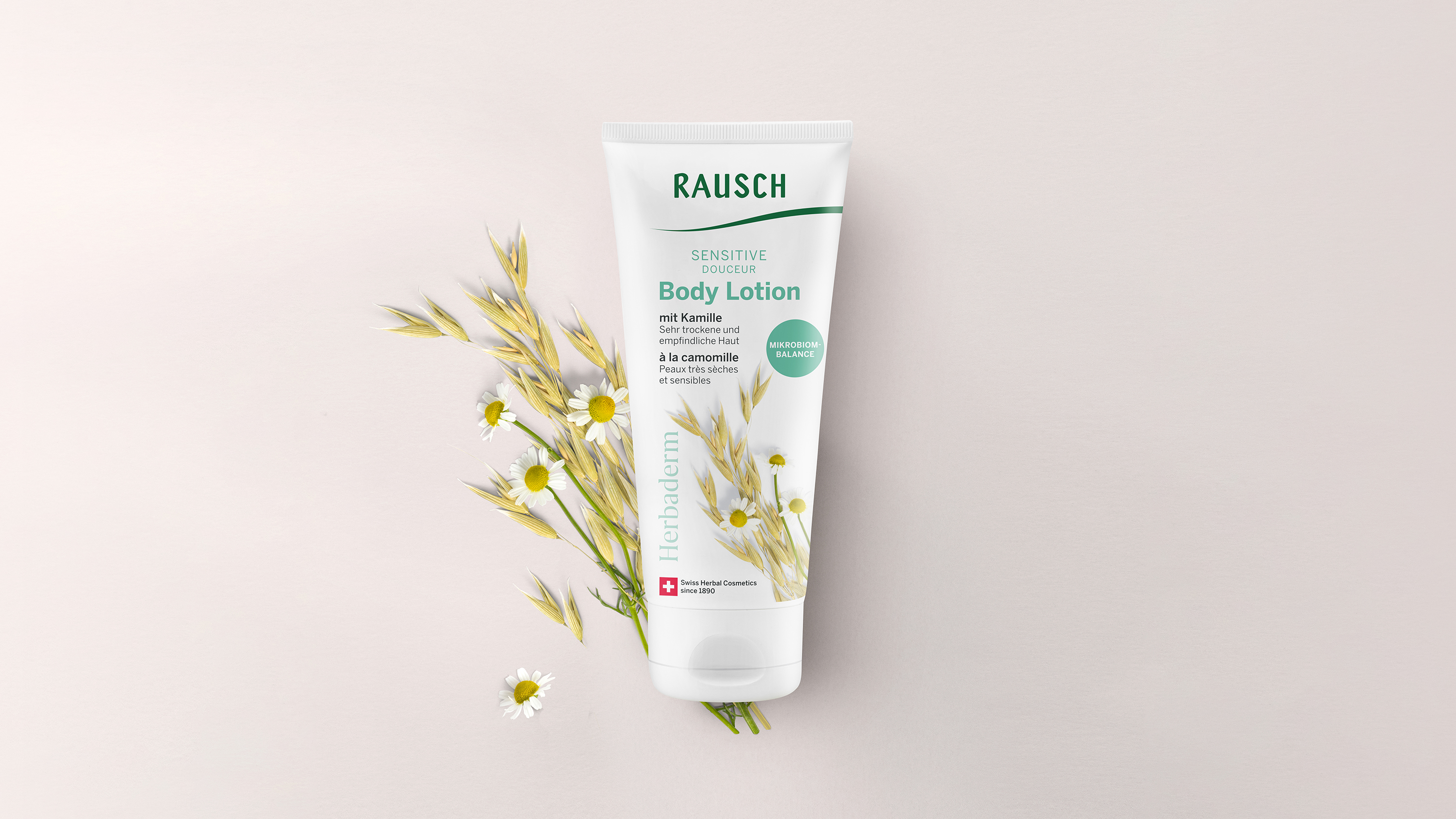
In addition to the hair care product category, RAUSCH also has a body care product line under the name ‘Herbaderm’. This subbrand, which has since been integrated into the RAUSCH brand, was given a new lease of life as part of the redesign, appearing in combination with a slightly adapted RAUSCH logo. The design principles, particularly with regard to the content hierarchy and the optimal communication of relevant messages, are also used on this packaging.
Website: rausch.ch