The challenge
After the insolvency and liquidation of its parent company Swiss carrier Germania Flug AG needs an entirely new brand image and new name within the shortest possible time – because every day the airline stays on the ground it incurrs high losses
The solution
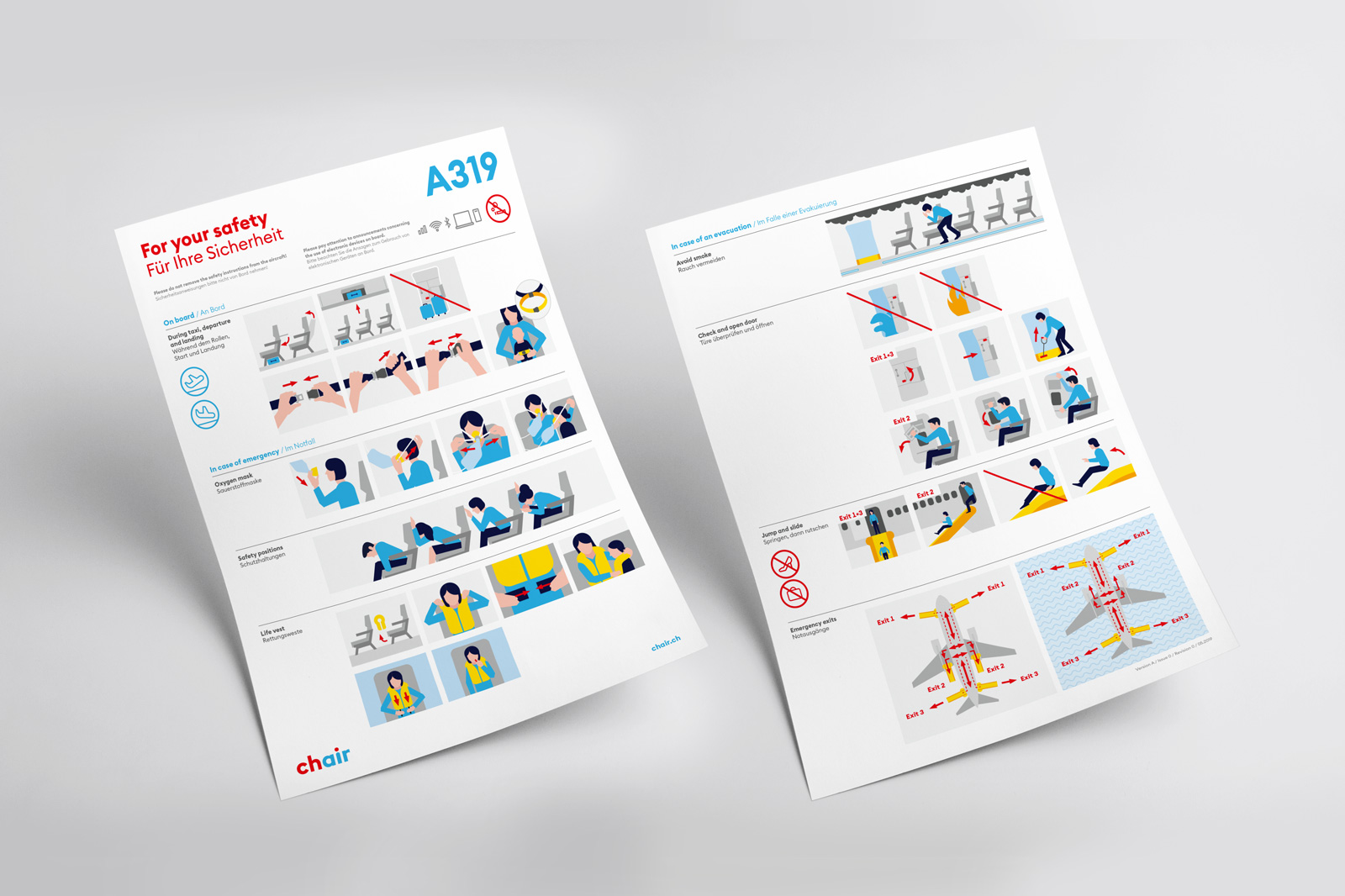
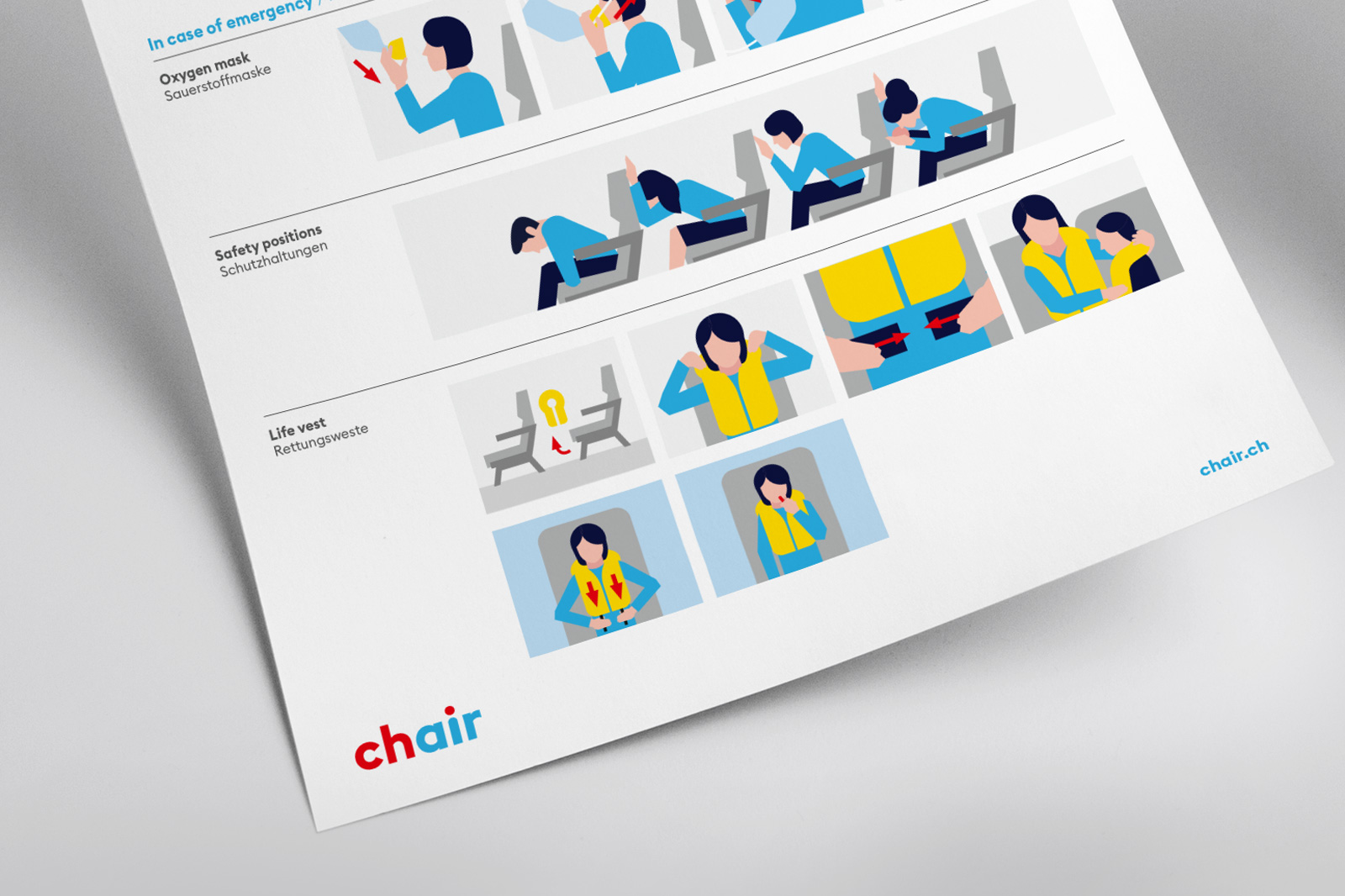
Conceiving a brand identity and appearance that combines Swissness with internationality and seriousness with ease – ranging from naming to image communication including the design of cabin personnel uniforms and fleet design. The result: Switzerland’s freshest airline.
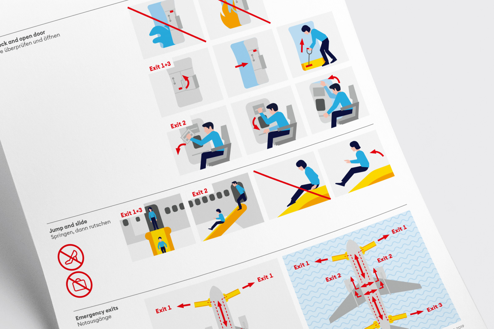
Due to its German parent company’s insolvency it has become time for Swiss carrier Germania Flug AG to make an independent fresh start. We have designed the airline’s overall appearance – from naming to designing cabin personnel’s uniforms across to fleet design and image communciation.
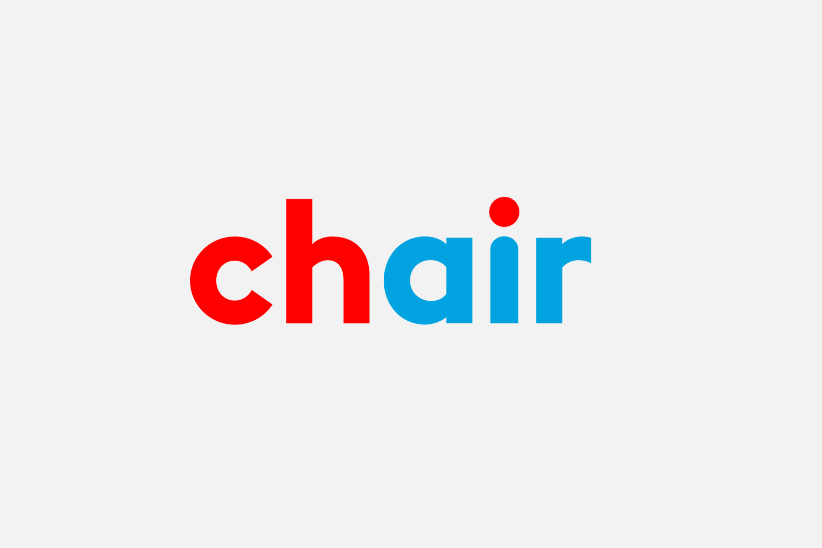
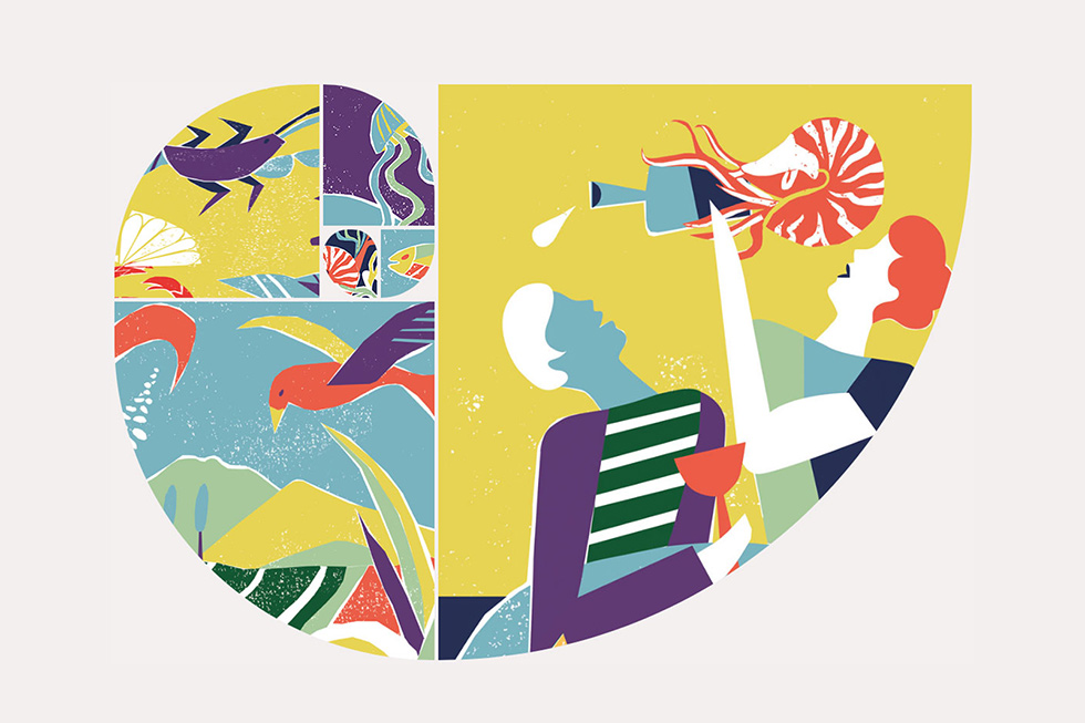
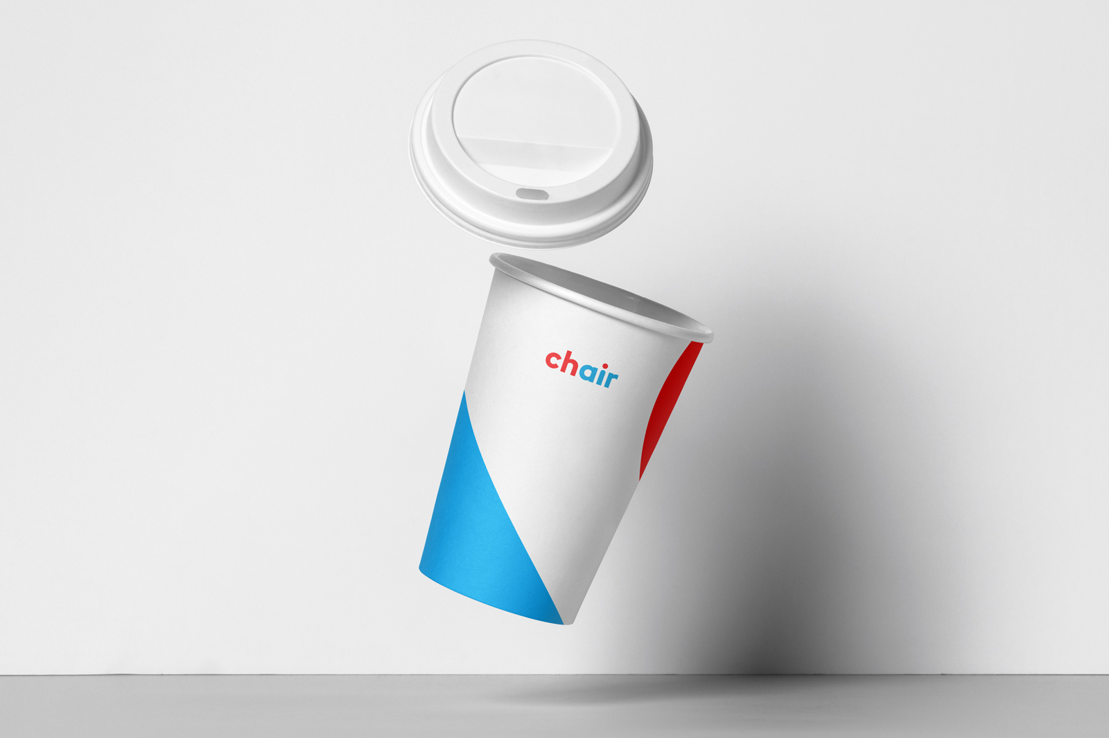
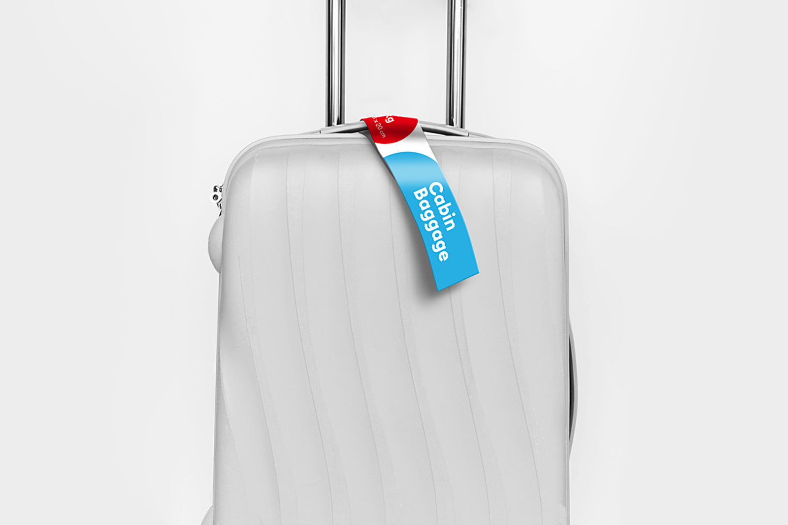
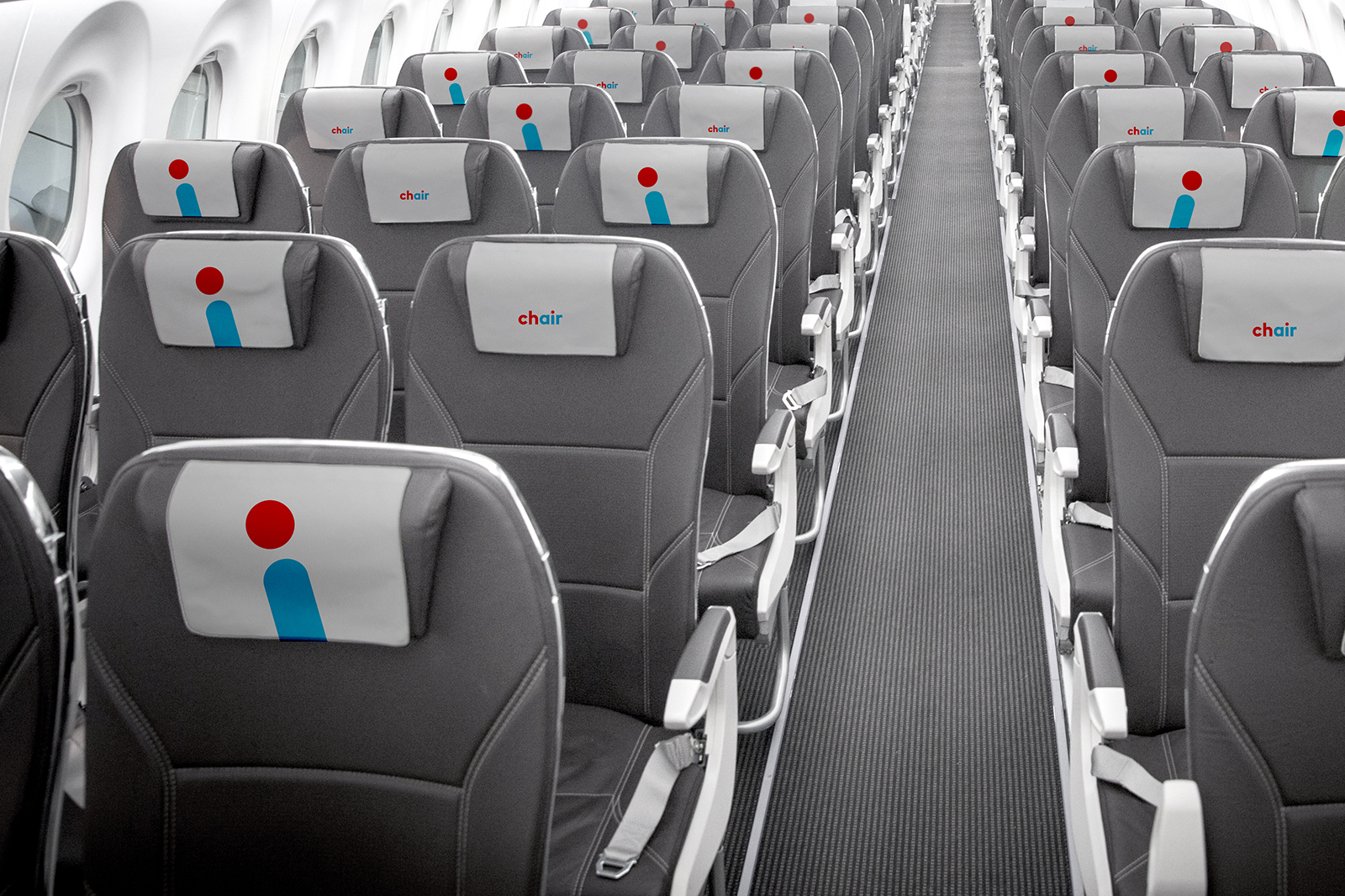
The name Chair was chosen for the scope it provides. The word chair symbolizes a seat on an aircraft while the color division between the red “ch” and the blue “air” is a play on the Swiss origin of the airline. Using this name also allows us to put a focus on the brand essence of the airline: It’s a young, uncomplicated and dynamic enterprise that has a cheerful, humorous, respectful and informal approach to its partners, customers and employees, with an occasional dash of cheek. Its dynamic spirit will be tangible and visible in the new appearance.
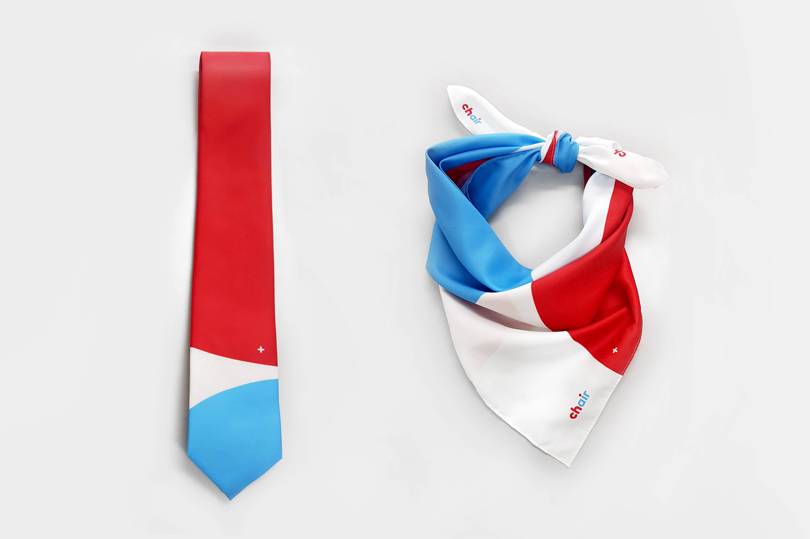
Chair’s new font with its rounded forms transports approachability and modernity. The colors red and blue create a link to the Swiss flag and the blue skies. The “i” with its red dot connects with the Swiss symbol “ch” transforming it into a supersign. Symbolizing a passenger reclining in an aircraft seat the red dot and the blue dash form the base of the dynamic and flexible design system.
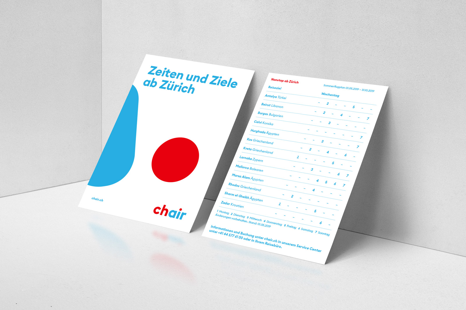
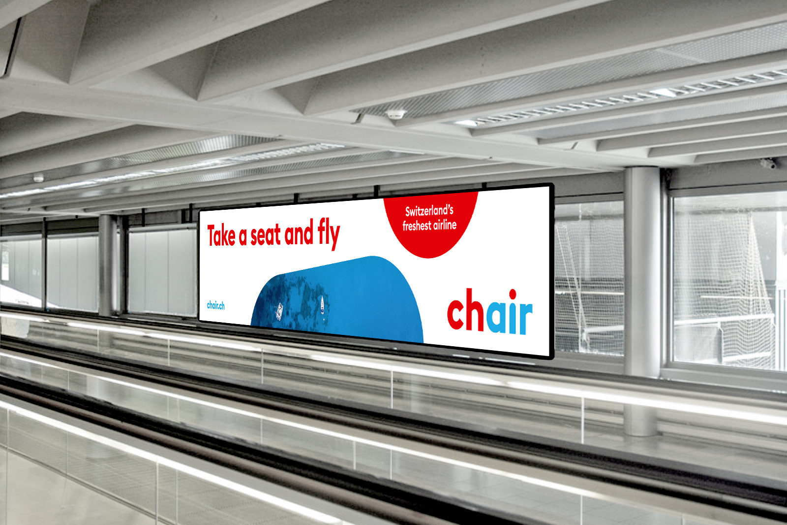
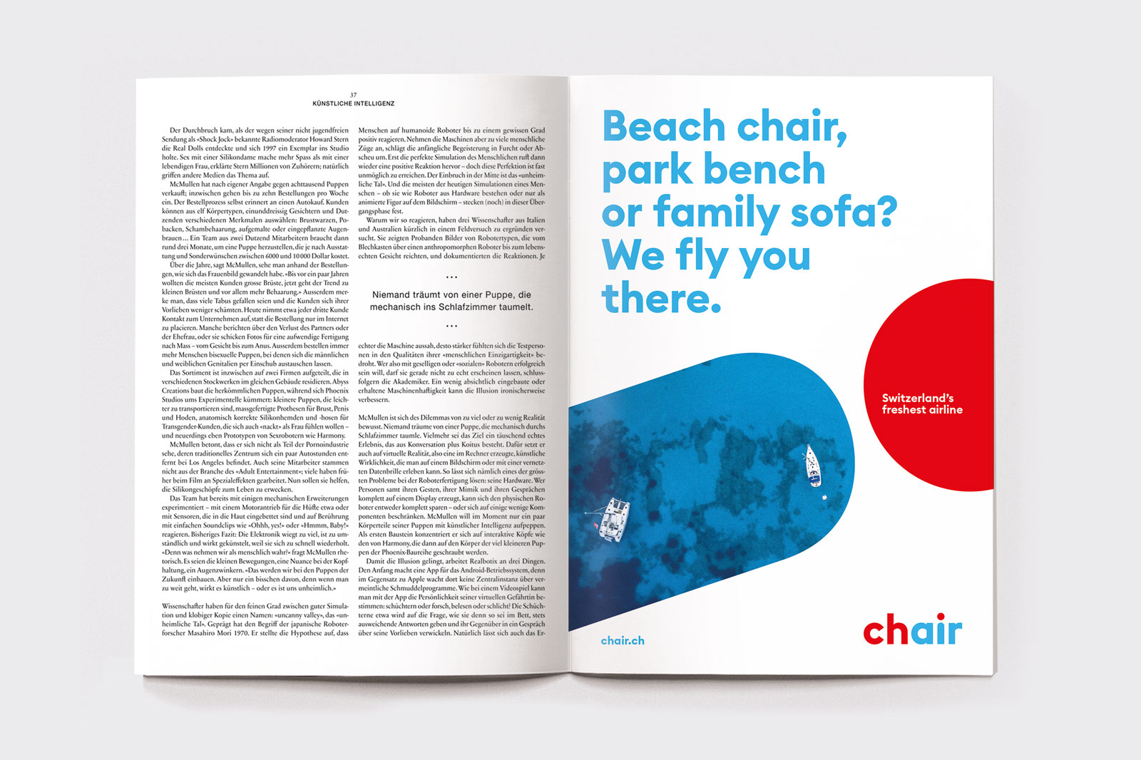
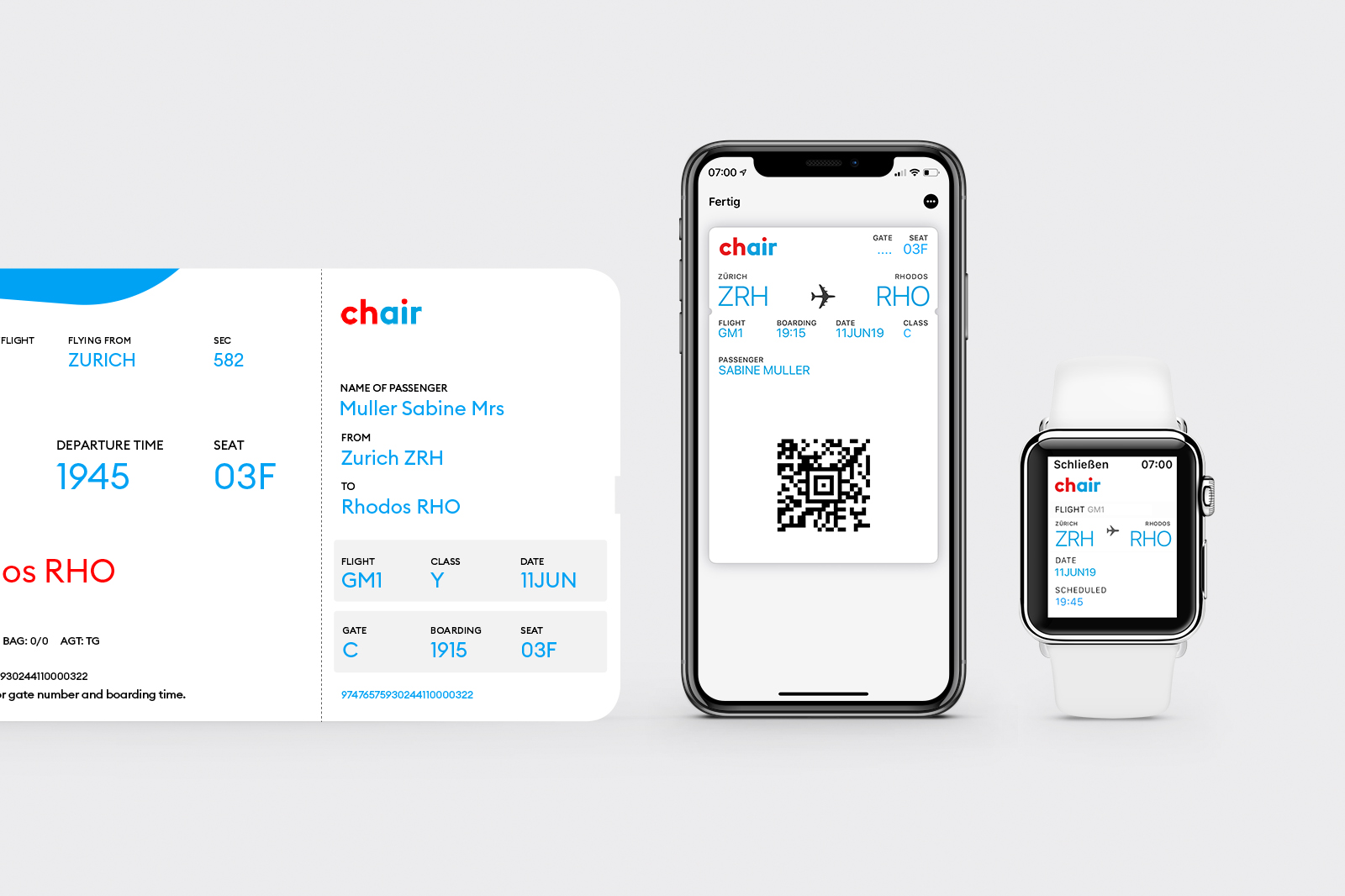
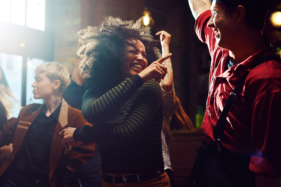
With European destinations ranging from Palma de Mallorca to Zadar, an international crew and single-class economy fare, Chair offers city trips, holiday flights and visits back home to a broad target group. From young holidaymakers to extended families – just take a seat and fly.
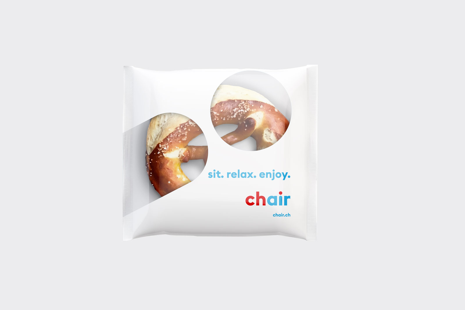
Chair’s design system is concepted to communicate the carrier’s straightforwardness: It reflects ease and humor and doesn’t take itself too seriously. Its forms don’t follow a tight corset and can be expressed not only by colors but also in images, without losing its recognition level.
For selected applications the design system also allows a combination of the supersign with the Swiss cross – the absolute icon of quality and reliability.
Website: chair.ch
Our work for Chair was awarded with